
My final clip has been uploaded to Vimeo at the following link. Sustainable Design Stopmotion.
I feel i have exceeded my own expectations of what i wanted to achieve with this project. I was able to successfully integrate the imagery of design sustainability with the speech and self-composed soundtrack. I used after effects to edit and render my clip and was able to achieve an aesthetic that is consistent with the imagery. I used a light writing technique in after effects to enhance the transitions of the paper forms and a strobe effect that increases to the climax of the clip. I then color corrected the clip to homogenize the aesthetic as a whole. The result, I believe is an visually interesting stop motion clip that discusses the importance of sustainable design.
Wednesday, 6 June 2012
DSDN101 - Project 3 - Development - Sound


For the audio of my stop motion clip i decided to compose my own soundscape and add speech over the top in Logic Pro 9. I used vst midi synths for the ambient strings then a text to speech engine for the spoken word.
Monday, 28 May 2012
DSDN144 - Project 3 - Finals


For this project i have come up with a concept i call "Light Architecture". I will investigate a variety of different locations and using the technique of light graffiti on a slow shutter speed setting i will attempt create a purely aesthetic set of images in which the space has been changed and manipulated with the use of light.
I feel I have been largely successful in creating an unique aesthetic with my series of four images. The images show spaces that have been changed by the use of light. After framing the images I then used the bulb setting to expose the sensor for the time it would take to draw in the lighting effects with torches. Once the light writing was complete I further exposed the sensor for a few more seconds to attempt to remove any shadows of myself as I drew in the light. I then used Photoshop to correct any over exposure. I ran into a few problems while doing my series. The first was not having any reference to what I was drawing until the shutter closed. I then kept the light writing simple to avoid this problem. The other problem I came across was over exposure of images due to the long shutter speed. To minimalize this I used a small aperture. Of all the spaces I investigated I narrowed it down to four and tried to separated each space as much as possible with my four different shots. The result in a dynamic series of photos, showing and almost third dimension of depth within the two dimensional frames. An interesting bi-product that I did not intend on creating.


Sunday, 27 May 2012
DSDN101 - Project 3 - Group Task 2
15 Second Clip Here

Company Name: Spot Cleaning Company
Provides:
A solution for cleaning up messes that is so efficient and effective
that it removes every trace of the mess in a fraction of the time as
other similar cleaning solutions.
Target Audience: 20 - 40 age group with little time or patience when it comes to having to clean up messes.
Slogan: “Clean up the mess”
The
intentions of this advertisement is to sell a cleaning solution to the
target demographic and differentiate the Spot Cleaning Company from
other companies who sell similar solutions.
This
advertisement targets its audience with strong visuals and sound that
grabs their attention and leaves a lasting impression in their minds, so
that the next time they need a cleaning solution the Spot Cleaning
Company advertisement will instantly spring to mind.
The
advertisement shows coke, paint, wood shavings, PVA glue and paper
being spilt, spurted, dropped and mixed together on a white backdrop to
the sound of classical music, and the video has a dirty quality feel to
it which gives it an arty feel and further enhances the mess making. The
final scene of a clean white backdrop with only the company slogan and
the type of product on offer is cut to quickly with the music being cut
off.
The
idea of cutting to the white backdrop so abruptly is to show the
audience that the Spot Cleaning Company’s cleaning solution is so
efficient and effective that it cleans up a big mess in no time at all,
and leaving no evidence that there was ever a mess there.

Wednesday, 23 May 2012
DSDN171 - Blog 5 - Locovisual

Prudential Assurance Building
The First World War had major effects on the world in the 1920s and the formation of Art Deco was a cultural, social and political manifestation of these effects. It wasn’t till the great depression of the 1930s was nearing its end that the New Zealand government began instigating new styling’s of Art Deco projects around the country. Built in 1935 the Prudential Assurance Building became the forefront of this movement and is now classed as a “Category II, Heritage Building” (Wellington City Council Heritage Inventory, 2012).
Plans for the building where drawn up by Melbourne architecture firm “Hennessy and Hennessy in association with local architects Gray Young Morton and Young” (WCCHI, 2012). Construction on the building started in 1934 as the British insurance firm Prudential Assurance’s new New Zealand head office, following the demolition of its previous Auckland office in 1934. To this day Prudential Assurance still owns and occupies the building, but are operating under a new name. The interior of the building has drastically changed from its original design, leaving only a few authentic oak banisters and marble floors in the stairwells. The exterior, however remains untouched as a definitive salute to the firm presence of Art Deco in Wellington.
The building’s distinct appearance has been what has kept it aesthetically relevant throughout the development of Wellington's CBD. The structure of the building consists of reinforced concrete, and a harmonious veneer of Benedict stone. Once we begin to dissect the buildings visual arrangement, the Art Deco influence behind its creation is evident. The frame and foundation of the building is almost entirely square with is four facades being strikingly similar in symmetry and ornament. The rhythm of the rectangular windows and the way they bisect the horizontal pediments and Parapets are reflective of art deco’s restrictive style, reminiscent of neoclassical architecture and its golden rule of thirds. The way the design of the building “rejects any natural rhythm and flower inspired by designs of the Art Nouveau style, in favour of a more masculine geometric style (Gallager, 2000) is also intrinsic to Art Deco.
Sources:
Wellington City Council Heritage Inventory. (2012). Heritage building search. Retrieved From: http://www.wellington.govt.nz/
Kelly, M. (1961) Heritage trail: art deco: Wellington's 1930s buildings. (2nd ed). Wellington City Council, Wellington: NZ.
Wilson, J. (1996) Zeal and crusade : The modern movement in Wellington (1st ed) . Te Whaiora Press, Christchurch: NZ
Gallager, F. (2000) Christie's Art Deco: Introduction. Pavilion, Shepherdstown, VW.
DSDN144 - Project 3 - Precedence
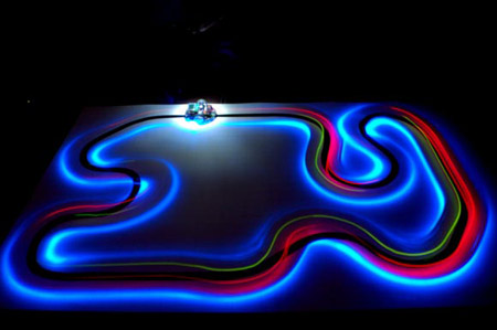
This shot further enforces my idea of using the lights in the shooting environment to create light trails. The above picture is of a slotcar set. The track itself has no light but because of the movement of the lights on the slotcar the track still exists by the representation of light.
Subscribe to:
Posts (Atom)